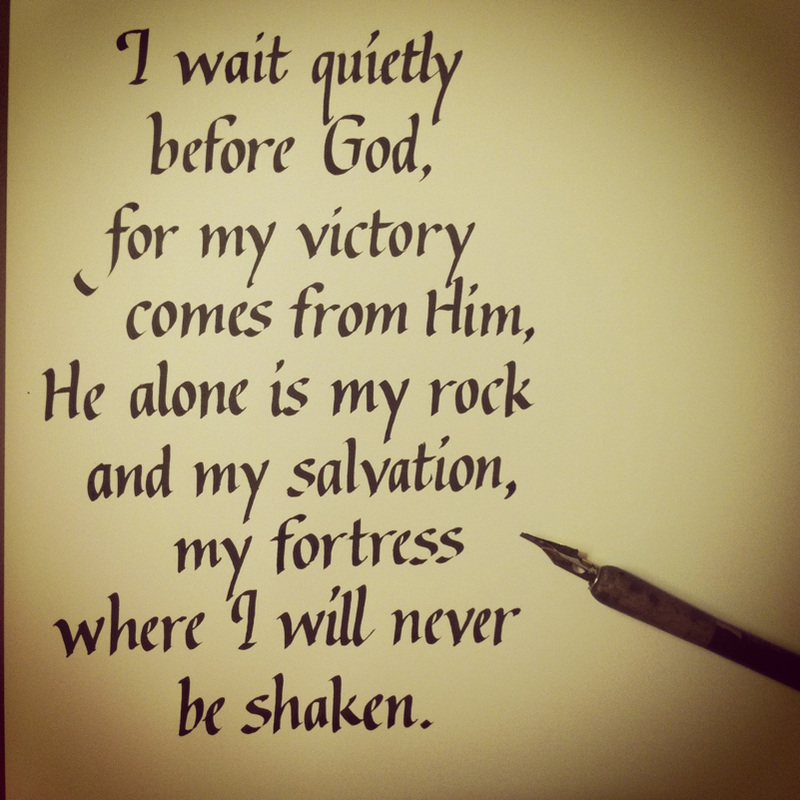
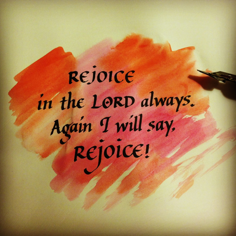
I have been coming across many verses like this one during my quiet time. Such a blessing, and I have found joy in waiting on the Lord. What a hope we have in Him.
| The Anonymous Scribe |
|
|||
|
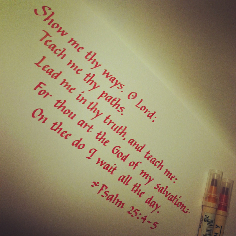
I have been coming across many verses like this one during my quiet time. Such a blessing, and I have found joy in waiting on the Lord. What a hope we have in Him.
0 Comments
My big personal art project this summer is an illuminated piece of scripture as a wedding gift for two very dear people in my life. The special couple requested Psalm 84:11-12. This week, after much prayer, and after mentally churning through the ideas of using a modern, freestyle approach or a medieval one, I decided on the classical elegance of the 15th century - in particular, the Whitevine style. During the Italian Renaissance, letters done in the Whitevine style embellished many illuminated manuscripts. See the gorgeous example below: 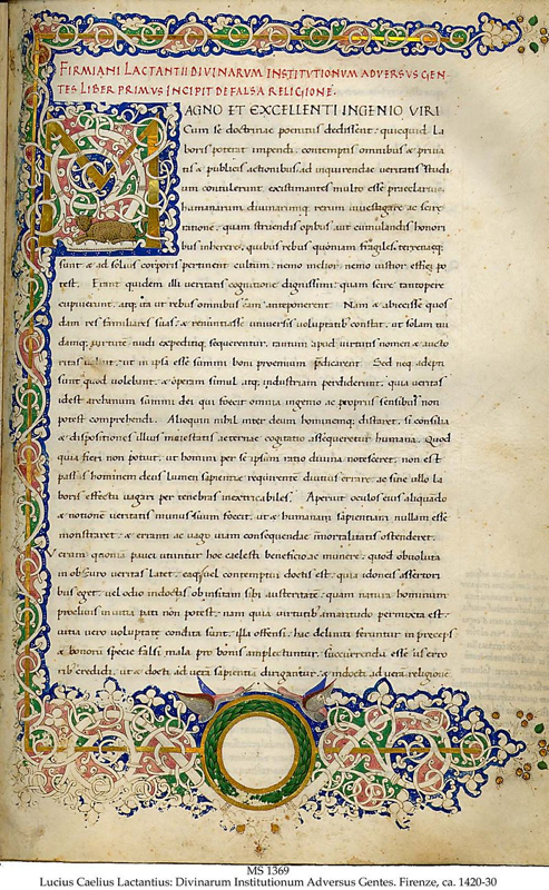 Making an initial like the one above is a lot like working through an intricate, albeit baffling maze. I often think a tendril of vine might go in a certain direction, only to find it redirect itself a different way. Some restraint is also necessary so that the vines don't end up looking like an uncontrolled, seething mess! It's also a challenge to make sure that the composition of the vines and the letter itself work together harmoniously; I didn't want the letter to become lost in all those intertwining vines. Here is the first sketch I made of the "F" that will start the verse, as a stand-alone initial: 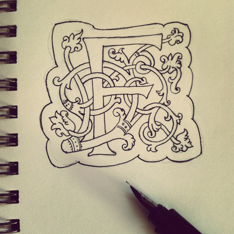 I have used the Whitevine style twice before in making wedding plaques such as this one, also with stand-alone intials. To challenge myself, I decided to make the "F" appear as if it were growing out of a column of interlacing vines. Here is a finished sketch done with pen and ink and colored pencil. The gold details were done with a fine Prismacolor metallic gold pen: 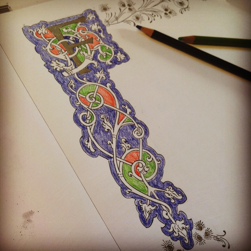 And here is a detail of the flourishes that curve along the top of the page. In the final piece, what appear as black lines will be painted with gold gouache. 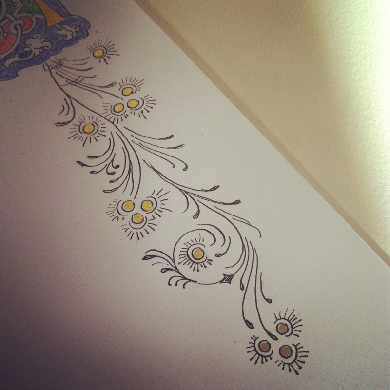 I've been clocking in about three hours a day working on Psalm 84: 1-2 for the past week. This evening's work ended after roughly writing out the verses in a lettering style loosely based on carolingian miniscules: 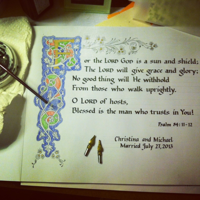 A practice run such as this one is essential for me so that I can look at the whole composition with a critical eye, look for where I need to make adjustments in spacing and alignment of letters, and just to get a feel for the entire verse. It's the blueprint for the finished product, which I will attempt tomorrow.
 Done with a 2.0mm Zig marker. Such a pretty color, it's called "Ocean." Getting warmed up for the evening while rediscovering my Pentel parallel pens. If you are into calligraphy, I highly recommend these pens for their fluidity and ease of making hairline strokes. 
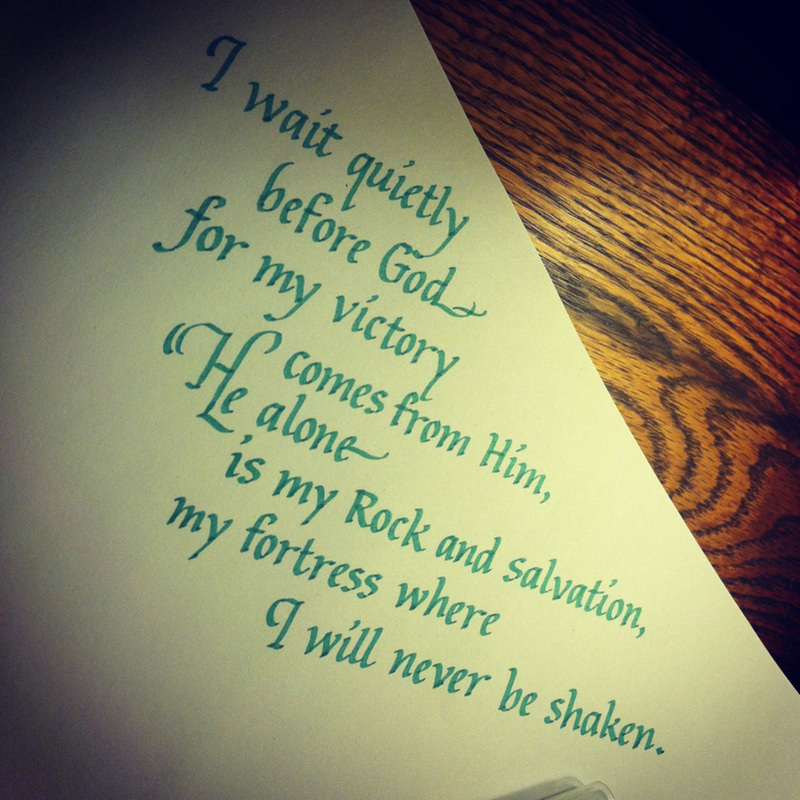
And here's another, non-Proverbs scribbling, this time from Psalm 84:11-- 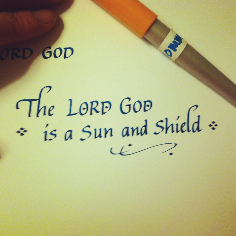
It has been a long while since I have used Gothic Blackletter, as you can probably tell. Practice is much needed, indeed! 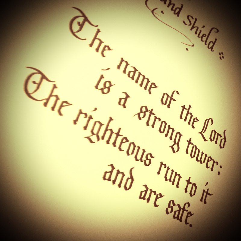
I teach art at an elementary school, which has stretched me a lot professionally and spiritually as well. The Lord has given me so many ideas for lessons through other teachers, books, and Pinterest (in this day and age? Of course!). I was on the lookout specifically for an art project that would mesh well with Poetry Month in April, and happened upon Paul Klee's Once Emerged From the Gray of Night (1918). 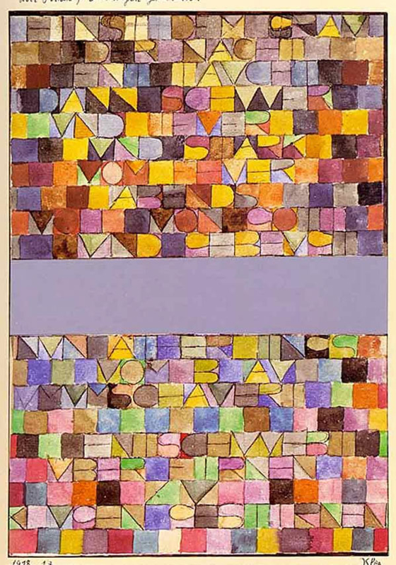 The letters in the poem, Once Emerged From The Gray of Night, written in German by Klee himself, form a dazzling tapestry of shapes and textures. The colors are so stunning, it's hard to believe that Klee once struggled bitterly to grasp the use of color while studying art at the Munich Academy. I haven't been this inspired and excited by an artist's work in a long time. I just had to find a way to teach this to my students! As a rule, I like to do a practice run of the art project before presenting it to children. This helps me figure out what would work well in the classroom, and what won't, and plan ahead for what challenges the children and I might face in creating our pieces.  As I worked on this sample, I had to first decide on what words I would use in my "word painting." Because this was going to be simplified for young children, I was very limited in the amount of space and text. I even used the same school grade art materials my students would be using, in this case, a No. 2 pencil, a black felt marker, and a Crayola watercolor set. The words from Scripture, "Be still and know that I am God" came to my mind, so I decided on the words "God Still Peace."  The finished painting. I think it's pretty awesome that this was made with an itty-bitty Crayola watercolor set!
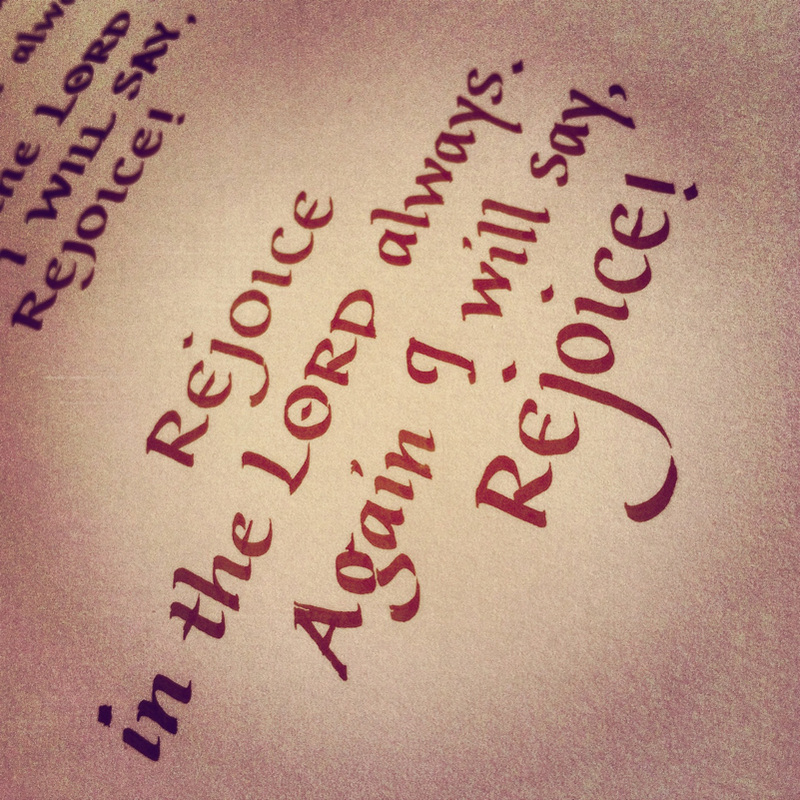
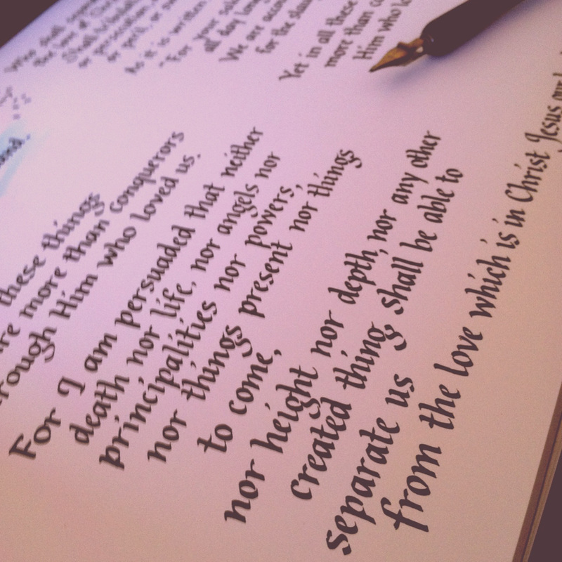
I've been trying to memorize the whole book of Philippians for a long while now. Putting verses into calligraphy often helps me to commit it to memory.
Work has been in full swing and it's been close to impossible to practice any calligraphy, but Valentine's Day this year presented the perfect opportunity. My workplace has organized a secret valentine pal exchange. I actually am not a fan of Valentine's Day, but it's been fun deciding what to place in my coworker's mailbox for the next several days. It's been a blessing as well--this person has particularly been someone I've been wanting to encourage. This note, with a Winnie-the-Pooh printout that I touched up with a Zig marker (wheat gold) will be accompanied by some Toblerone chocolate, and sneaked into my secret pal's box tomorrow morning. (-:  This is what I gave on the fourth day: a small tin of cookies, an origami heart bookmark, and a paper crane pin.  And on the fifth day (my gift wrapping skills leave much to be desired). The gift tag was cut out of parchment.  As pressed for time as I was this week with the demands of my work, it was truly a joy to spend time thinking of, making, and shopping for gifts my valentine pal.
|
The Scribbler's Blog features my latest projects, dabblings, and scribblings. This is where I keep track of all my creative, artistic explorations and wanderings as I meditate on God's Word. Archives
July 2013
Categories
All
|
 RSS Feed