Lately my career has left little room or time for calligraphy, but this Christmas I committed myself to making gifts for two dear friends. A few years ago I thought of using Bible verses in paperweights, and decided to revisit the idea this past week.
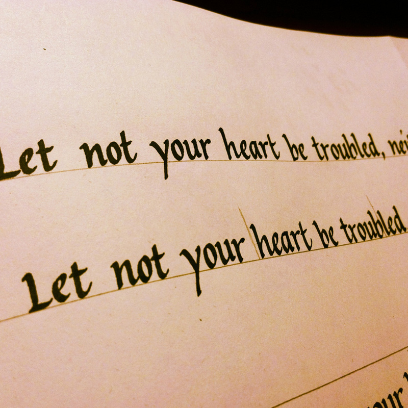
The creative process starts with the verse itself. In this case I chose a verse that I knew held special meaning for the person I was intending it for. I always start the project prayerfully, asking the Lord to help me shape and envision the verse in a way that will honor Him. Then I write out the verse in plain Roman italic, without any thought or care of design.
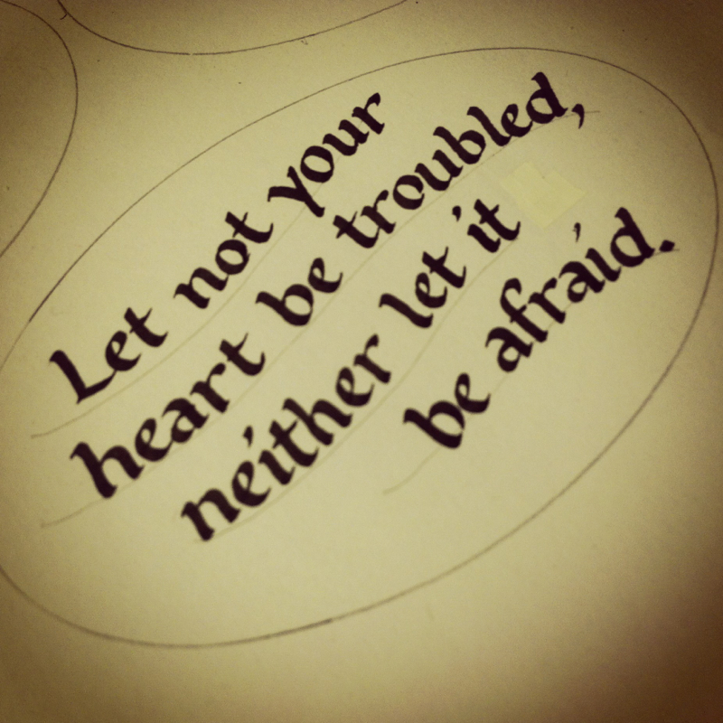
After I meditate on the verse a while and consider its meaning, I begin to plan the design. John 14:27 is one of the most comforting, reasssuring words in the Bible, so I thought of a soft, flowing look to the verse. I also happened to have an oval-shaped glass paperweight on hand, so I experimented with the arrangement and flow of the words within an oval space. I decided on this one:
The creative process starts with the verse itself. In this case I chose a verse that I knew held special meaning for the person I was intending it for. I always start the project prayerfully, asking the Lord to help me shape and envision the verse in a way that will honor Him. Then I write out the verse in plain Roman italic, without any thought or care of design.
After I meditate on the verse a while and consider its meaning, I begin to plan the design. John 14:27 is one of the most comforting, reasssuring words in the Bible, so I thought of a soft, flowing look to the verse. I also happened to have an oval-shaped glass paperweight on hand, so I experimented with the arrangement and flow of the words within an oval space. I decided on this one:
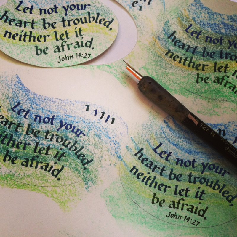
Let there be color!
After the composition is set, I begin to play with color. I decided to try something new and used pastel as a background, with soothing blues and greens and a hint of yellow. I made sweeping, S-shaped curves with the side of the pastels to apply color that would support the wavy flow of the text:
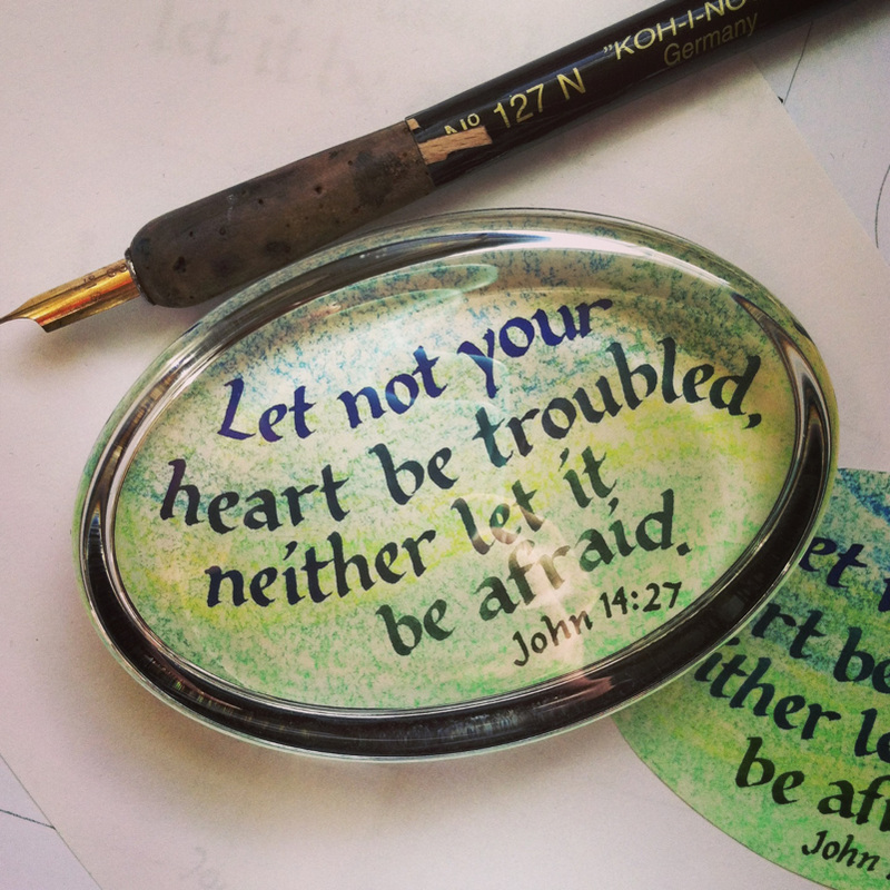
And finally . . .
The finished paperweight: Grumbacher watercolors (a mix of Hooker light green, ultramarine, and light blue) and Rembrandt pastels on colored (cream) cardstock. Most of the lettering was done with a C4 Speedball nib, except for the Scripture reference. Fixative was applied last to avoid smudging the glass.
 RSS Feed