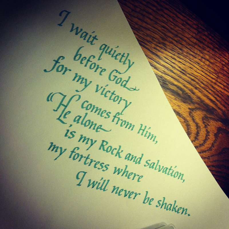
I have been coming across many verses like this one during my quiet time. Such a blessing, and I have found joy in waiting on the Lord. What a hope we have in Him.
| The Anonymous Scribe |
|
|||
|
I have been coming across many verses like this one during my quiet time. Such a blessing, and I have found joy in waiting on the Lord. What a hope we have in Him.
0 Comments
My big personal art project this summer is an illuminated piece of scripture as a wedding gift for two very dear people in my life. The special couple requested Psalm 84:11-12. This week, after much prayer, and after mentally churning through the ideas of using a modern, freestyle approach or a medieval one, I decided on the classical elegance of the 15th century - in particular, the Whitevine style. During the Italian Renaissance, letters done in the Whitevine style embellished many illuminated manuscripts. See the gorgeous example below: 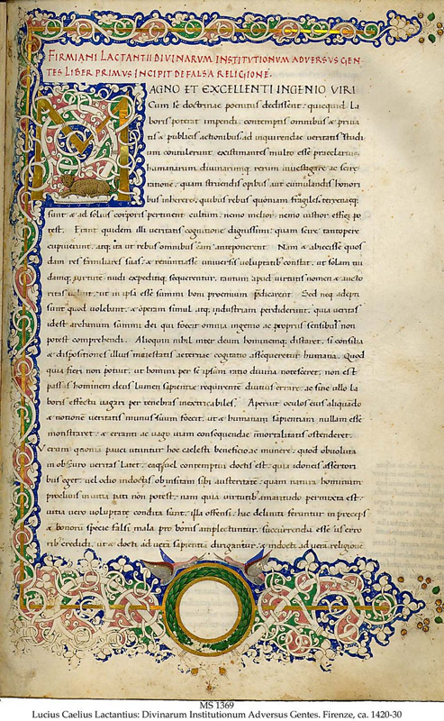 Making an initial like the one above is a lot like working through an intricate, albeit baffling maze. I often think a tendril of vine might go in a certain direction, only to find it redirect itself a different way. Some restraint is also necessary so that the vines don't end up looking like an uncontrolled, seething mess! It's also a challenge to make sure that the composition of the vines and the letter itself work together harmoniously; I didn't want the letter to become lost in all those intertwining vines. Here is the first sketch I made of the "F" that will start the verse, as a stand-alone initial: 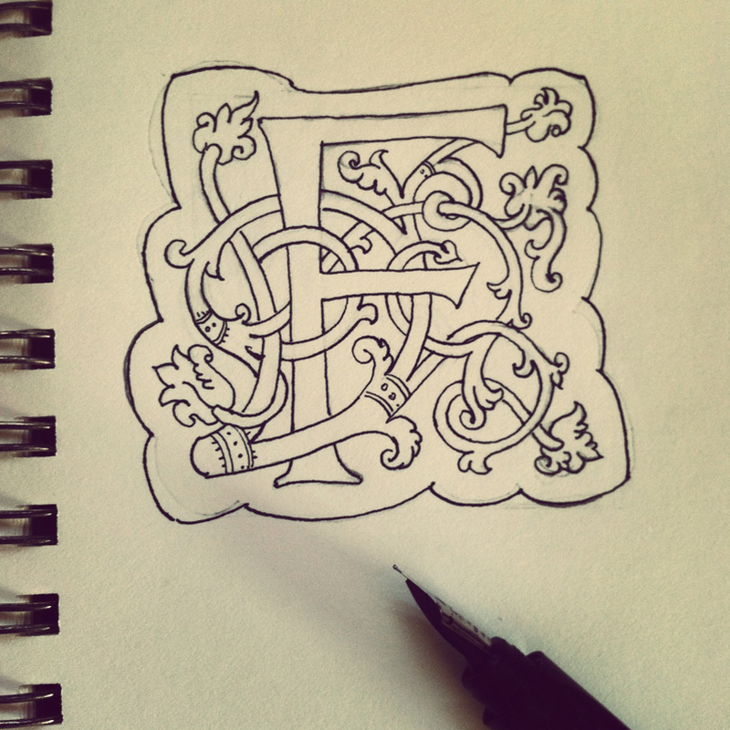 I have used the Whitevine style twice before in making wedding plaques such as this one, also with stand-alone intials. To challenge myself, I decided to make the "F" appear as if it were growing out of a column of interlacing vines. Here is a finished sketch done with pen and ink and colored pencil. The gold details were done with a fine Prismacolor metallic gold pen: 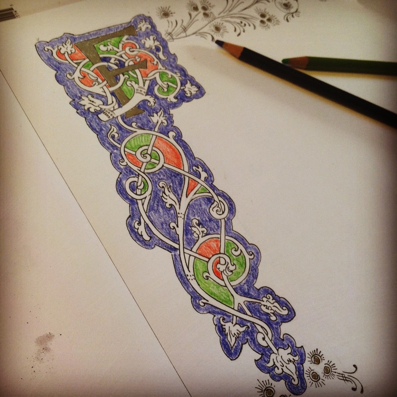 And here is a detail of the flourishes that curve along the top of the page. In the final piece, what appear as black lines will be painted with gold gouache. 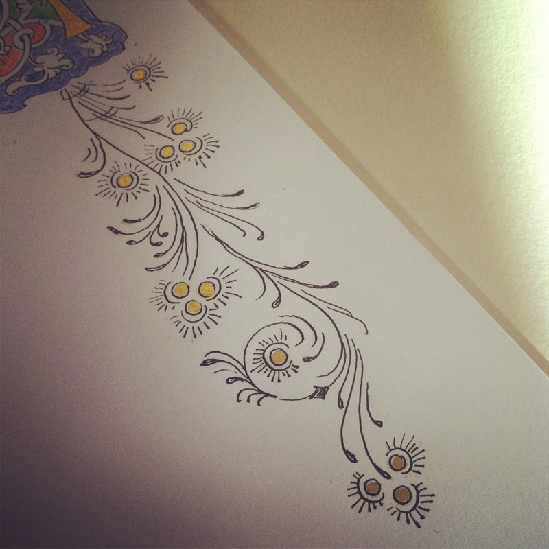 I've been clocking in about three hours a day working on Psalm 84: 1-2 for the past week. This evening's work ended after roughly writing out the verses in a lettering style loosely based on carolingian miniscules: 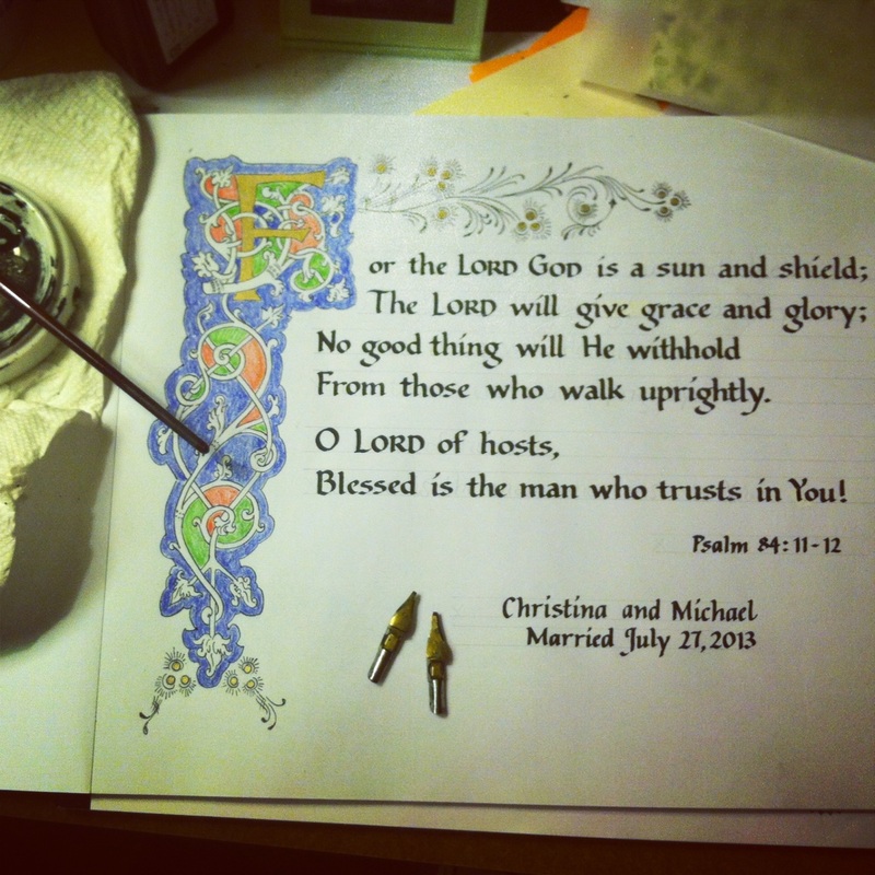 A practice run such as this one is essential for me so that I can look at the whole composition with a critical eye, look for where I need to make adjustments in spacing and alignment of letters, and just to get a feel for the entire verse. It's the blueprint for the finished product, which I will attempt tomorrow.
 Done with a 2.0mm Zig marker. Such a pretty color, it's called "Ocean." Getting warmed up for the evening while rediscovering my Pentel parallel pens. If you are into calligraphy, I highly recommend these pens for their fluidity and ease of making hairline strokes. 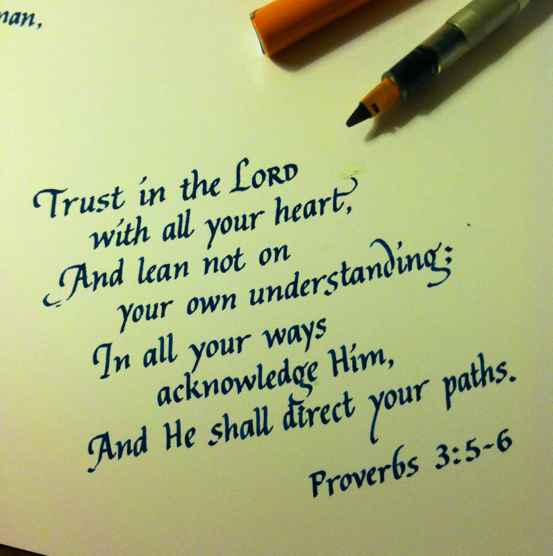
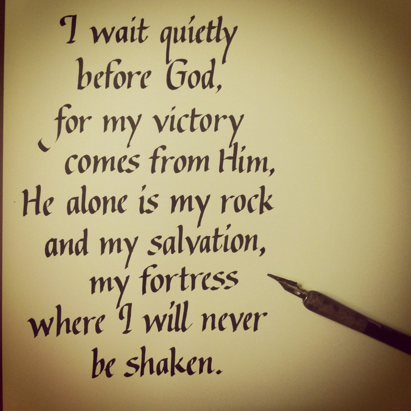
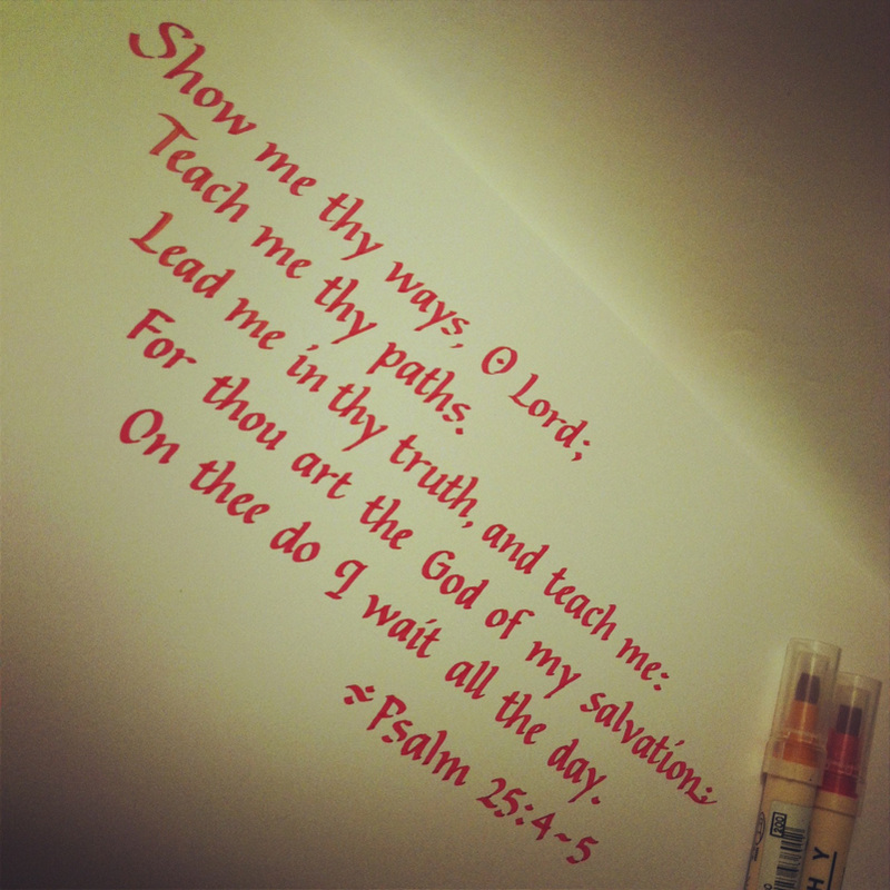
And here's another, non-Proverbs scribbling, this time from Psalm 84:11-- 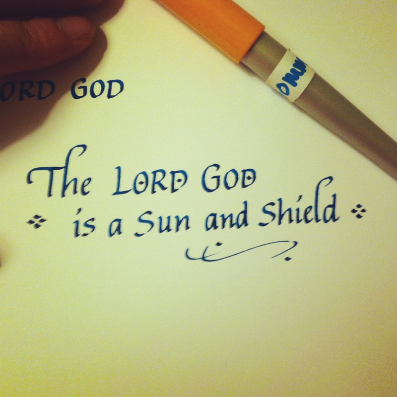
It has been a long while since I have used Gothic Blackletter, as you can probably tell. Practice is much needed, indeed! 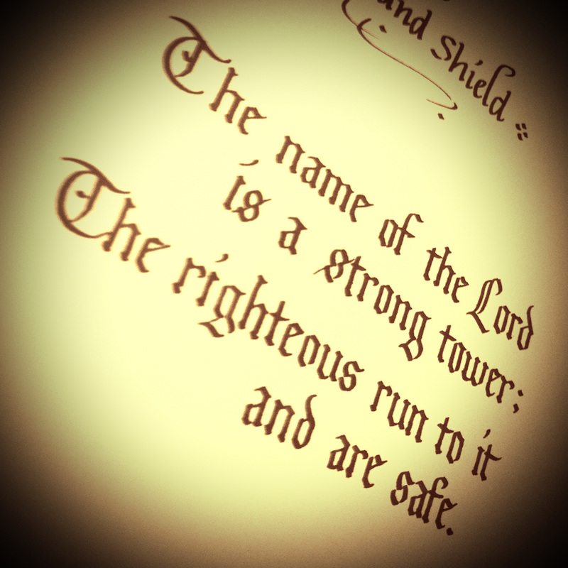
|
The Scribbler's Blog features my latest projects, dabblings, and scribblings. This is where I keep track of all my creative, artistic explorations and wanderings as I meditate on God's Word. Archives
July 2013
Categories
All
|
 RSS Feed